Blog
Bootstrap Is The Easiest Way To Style React Apps in 2023
January 12, 2023 - Roy Derks
This blog post will teach you how to use Bootstrap 5 to style a React application. With Bootstrap, you don't have to write any stying rules yourself; instead, you can use class names to apply styles to HTML elements.
Click the image below to watch the YouTube video version of this blog post:
 VIDEO: Create a React Project From Scratch Without any Framework
This blog post is extracted from my book React Projects, available on Packt and Amazon.
Why use Bootstrap?
IMO, Bootstrap is still the easiest way to style a React application. Bootstrap has been around for a long time and is widely used across web applications of all sorts and sizes. And build with different frameworks or tools, ranging from WordPress to React. There are a few reasons why you might want to use Bootstrap to style a React app:
- Ease of use: Bootstrap is a well-documented and widely-used CSS framework, making it easy to start and learn.
- Responsive design: Bootstrap includes a responsive grid system and predefined styles for common UI elements, which makes it easier to build a responsive app that looks good on multiple devices.
- Time savings: Using a CSS framework like Bootstrap can save you time by providing a set of pre-styled UI components that you can use out-of-the-box, rather than style everything from scratch.
- Consistency: By using a common CSS framework, you can ensure that your app has a consistent look and feel, which can improve the user experience.
Overall, Bootstrap (or any other CSS framework) can be useful for building a well-designed and responsive React app more efficiently.
Installing Bootstrap
You can install Bootstrap using npm or yarn. For this blog post, we will use npm:
npm install --save-dev bootstrap
This will install Bootstrap as a devDependency in your project, and it will only be used during development and will not be included in the production build. By installing Bootstrap you can now include the CSS in your project by importing it in the root of your React project, for example, your index.js file that contains the root component of your app:
import ReactDOM from 'react-dom/client';
import List from './containers/List';

import 'bootstrap/dist/css/bootstrap.min.css';

function App() {
  // ...
}

const container = document.getElementById('app');
const root = ReactDOM.createRoot(container);

root.render(<App />);
The important part in the code block above is the line import 'bootstrap/dist/css/bootstrap.min.css', which will import the Bootstrap CSS file from the node_modules directory. This will make the Bootstrap styles available to your app.
Using Bootstrap components
Bootstrap includes several pre-styled components that you can use in your React app. For example, you can use the NavBar component to add a header element to your application.
To use this component, you can copy-paste the following code block and use it in your app:
import React from 'react';
import 'bootstrap/dist/css/bootstrap.css';

export default function Header() {
  return (
    <nav class="navbar bg-body-tertiary">
      <div class="container-fluid">
        <a class="navbar-brand" href="#">
          <img src="https://getbootstrap.com/docs/5.3/assets/brand/bootstrap-logo.svg" alt="Logo" width="30" height="24" class="d-inline-block align-text-top">
          Bootstrap
        </a>
      </div>
    </nav>
  )
}
Which will render the following header:
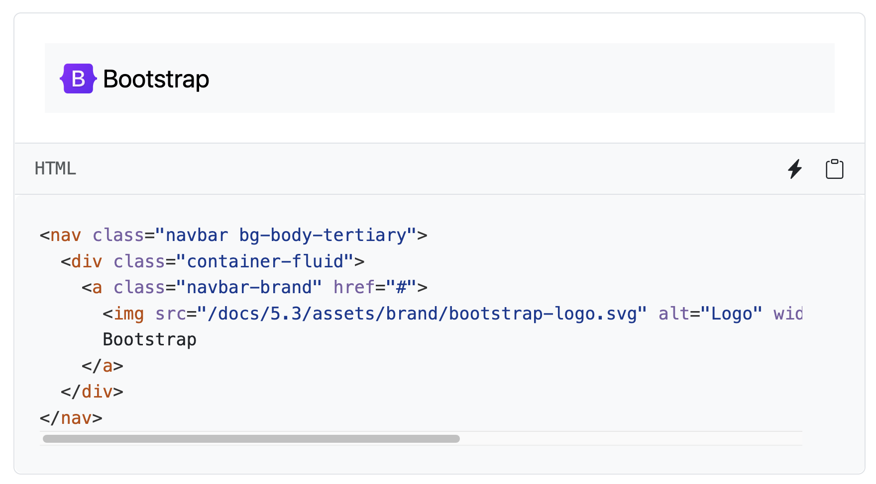 Bootstrap NavBar component
By adding the correct class names to HTML elements, you will get a modern-looking header that you don't need to style.
Of course, there are much more Bootstrap components that you can use in your React app. For example, you can use the Card component to render a card with a title, image, and text:
import React from 'react';
import 'bootstrap/dist/css/bootstrap.css';

export default function Card() {
  return (
    <div class='card' style='width: 18rem;'>
      <img src='...' class='card-img-top' alt='...' />
      <div class='card-body'>
        <h5 class='card-title'>Card title</h5>
        <p class='card-text'>
          Some quick example text to build on the card title and make up the
          bulk of the card's content.
        </p>
        <a href='#' class='btn btn-primary'>
          Go somewhere
        </a>
      </div>
    </div>
  );
}
Which will render the following card:
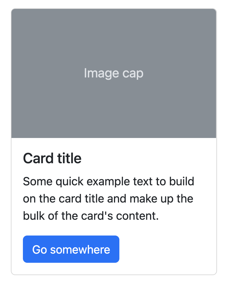 Bootstrap Card component
With just a few lines of HTML you can render a card with a title, image, and text. And you can extend this further by using Bootstrap utilities or custom CSS to style the card even more.
Bootstrap utilities
Bootstrap includes a set of utility classes that can be used to apply common styles quickly and easily. These utility classes are designed to be used in conjunction with other Bootstrap styles and can be used to override or extend the default styles of certain elements.
Some of the Bootstrap utilities include:
.text-*:These classes can be used to apply different colors to text, depending on the context (e.g. .text-primary, .text-secondary, etc.)..bg-*:These classes can be used to apply different background colors to elements (e.g. .bg-primary, .bg-secondary, etc.).
Let's look at an example:
import React from 'react';
import 'bootstrap/dist/css/bootstrap.css';

function App() {
  return (
    <div className="container mt-5">
      <div className="row">
        <div className="col-md-6">
          <div className="card bg-primary text-white">
            <div className="card-body">
              <h5 className="card-title">Primary Card</h5>
              <p className="card-text">Some quick example text to build on the card title and make up the bulk of the card's content.</p>
            </div>
          </div>
        </div>
        <div className="col-md-6">
          <div className="card bg-secondary text-white">
            <div className="card-body">
              <h5 className="card-title">Secondary Card</h5>
              <p className="card-text">Some quick example text to build on the card title and make up the bulk of the card's content.</p>
            </div>
          </div>
        </div>
      </div>
    </div>
  );
}

export default App;
In this example, we use Bootstrap's grid system to create a layout with two equal-width columns, and we use the .bg-primary and .bg-secondary classes to give the cards different background colors. We are also using the .text-white class to make the text white to be visible against the colored backgrounds.
These are just a few examples of Bootstrap utilities. Many others are available, and you can find more information in the Bootstrap documentation.
Conclusion
This blog post has shown how to use Bootstrap 5 to style a React application. With Bootstrap you don't have to write any stying rules yourself. Instead, you can use class names to apply styles to HTML elements. Of course, you can also use Bootstrap utilities to apply common styles quickly and easily.
This blog post is extracted from my book React Projects, available on Packt and Amazon.
I hope you learned some new things about styling in React! Any feedback? Let me know by connecting to me on LinkedIn, X or Bluesky. Or leave a comment on my YouTube channel.